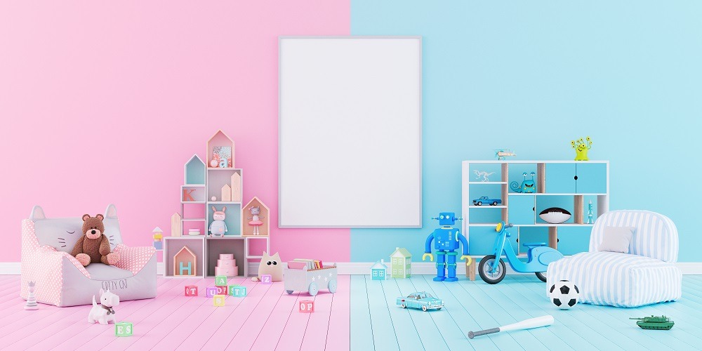
Picture yourself in a modern nursery for a recently born child, probably a child of your friend’s or family members’. In terms of the room’s colors, you would expect pink for a girl, and blue for a boy, right? Well, in a contemporary nursery or child’s room, these traditional gender color stereotypes might be challenged. Challenging them is often a conscious design choice that not only makes a statement, but reflects a deep historical evolution of color use in our society. This link between pink/red for girls and blue for boys wasn’t always the case. The history of pink and blue as colors contains several different meanings throughout the years, and they were influenced by cultural, social, and marketing factors. By examining this history and relationship, we can better understand the influence of these colors in modern interior design.
Historical Context of Gender Color Stereotypes
Early Practices in Child Clothing
Let’s begin this exploration of gender color stereotypes with some historical context, starting with early practices in children’s clothing. All the way back in the 19th century, babies of both genders were typically dressed in white. This was because white cotton was easy to bleach. Additionally, both boys and girls wore dresses since they provided much easier and more convenient access for diaper changes. Pastel colors like pink and blue did not become popular until the mid-19th century but weren’t gender-specific until later. Modern interior designers can use this insight to break away from these gendered color schemes when designing nurseries and children’s rooms.
Initial Gender-Specific Assignments
Further down the line, in the early to mid- 20th century, the gender color stereotypes of the time were the opposite of what we know today. The recommendations for gender-specific colors included pink/red for boys and blue for girls. At the time, red and shades derived from it, like pink, were seen as strong and masculine colors. Meanwhile, blue was seen as a delicate and feminine color. Blue’s association with the Virgin Mary from the Christian Bible also influenced this blue for girls history.
The Shift in Color Associations
Post World War II Changes
As with many elements of history, the end of World War II had a large impact on the gender color stereotypes of the time. The history of pink and blue established at the time began to shift. Colors like pink became more associated with girls and femininity, partly due to changes in fashion trends and the influence of military uniforms from the war. Specifically, the German military’s usage of pink triangles to identify homosexual individuals made a large contribution to the shift of pink from a masculine to a feminine color. Many interior designers use this historical shift to inform how they approach colors in projects, such as using historically informed color palettes.
Marketing and Gender Colors
Marketing and media influences also contributed to the shift in gender color stereotypes. Mid-20th century advertising played a large role in reinforcing the relationship between color and gender identity. During this time, children’s products like clothing were marketed in pink or blue to more clearly distinguish between girls and boys. Department stores like Franklin Simon’s and Macy’s promoted these gender color stereotypes. Their promotion had a significant impact on the relationship between color and gender identity as we know it today. Realizing this helps designers create spaces that challenge gender color stereotypes, which leads to more variety and personalization in color choices.
Contemporary Perspectives and Changes
Modern Re-evaluation
Looking at the history of pink and blue from contemporary context reveals some interesting new perspectives. In today’s world, there is increasing distaste for these hard-line gender color stereotypes. Modern interior design trends that emphasize flexibility and inclusivity, as well as trends in general, have been moving towards more gender-neutral colors options for both boys and girls. This shift has been partly influenced by modern gender studies, which look at color as more of a social construct than an inherent gender trait.
Cultural Variations
Additionally, various cultures around the world have varied perceptions of the relationship between color and gender. For instance, some Eastern cultures still associate pink with men. International perspectives like this often influence and enhance home design choices in these multi-cultural households. International marketing endeavors and ongoing globalization also contribute to a blending and reevaluation of traditional gender color stereotypes. This is reflected in how interior designers enhance spaces with thoughtful, culturally sensitive projects such as enhancing homes with sunrooms.
Reinterpreting Color in Interior Design
It’s easy to see how much the relationship between color and gender identity has changed over the years. Many cultural, social, historical, and marketing factors have influenced this change, such as the religious associations with the color blue, the way the color pink was used by the German military during World War II, and how department stores such as Macy’s marketed children’s clothing at the time. That being said, the future of color and gender perceptions in interior design likely will continue to move towards more inclusive and gender-neutral colors. Embracing these changes lets designers create spaces that are both aesthetically pleasing and socially conscious.


