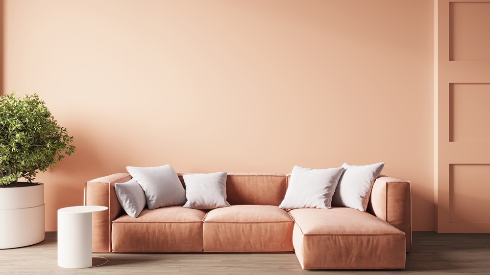
Accent colors and modern interior design certainly go hand in hand. Accent colors are defined as secondary colors which are used in small quantities to add interest or punch to a given color scheme. In modern interior design, accent colors add those finishing touches to a room, either complementing or contrasting the rest of the room’s color scheme. These colors differ from the primary and secondary colors in a color scheme because they’re used in very small amounts to accentuate those primary and secondary colors. This accentuation adds depth, character, and/or focal points in modern interior design. In this article, you’ll find some popular color combinations, techniques for using accent colors, applications for accent colors in different rooms, and current trends.
The Role of Accent Colors in Modern Interior Design
It’s apparent that accent colors play a huge role in modern interior design. This is because accent colors break up the monotony of a given color scheme by adding visual interest. Interior design tips dictate that depending on the chosen color, accent colors can also influence certain emotions and moods. For instance, red can stimulate excitement, yellow can stimulate cheerfulness, and blue can be calming. Some examples of effective accent color usage include a living room with a single blue accent wall to foster a serene atmosphere, or an office space with a single bright yellow chair to stimulate creativity and focus.
Popular Accent Color Combinations
Gray and Yellow
Here are some more great examples of accent color combinations popular in modern interior design. First, gray and yellow provide a bold and balanced look in any room color schemes. Pair some gray walls with yellow throw pillows or other décor elements for a vibrant but balanced look. This way, you benefit from both the neutrality of gray and the energy of yellow.
Blue and White
Blue and white make more popular accent color combinations in today’s interior design. The combination of these colors provides a clean and calming vibe to the space where it’s used. Room color schemes including a white room with a blue accent wall like the living room mentioned above or blue accessories evoke a sense of calm and cleanliness. This combination also has the added benefit of enhancing a room’s brightness and openness.
Green and Neutral Tones
Modern interior design trends also include green and neutral tones as accent color combinations. Combinations of these colors tend to be natural and relaxing. For example, you can pair green walls with neutral colored furniture, such as gray or beige, for a soothing and natural atmosphere. This way, you can promote relaxation and a deeper connection to nature with your accent color combinations.
Bold Colors and Metallics
Finally, pairing bold colors and metallics goes a long way in today’s interior design world. This combination lends a glamourous and dynamic look to the spaces which it occupies. You can leverage these room color schemes with dark walls with gold or silver accents for that touch of glamour. By doing so, you can add sophistication and a modern edge to your spaces.
Techniques for Incorporating Accent Colors
Accent Wall Ideas
Now that you’ve seen some examples, it’s time to learn some interior design tips and techniques to incorporate accent colors, starting with accent wall ideas. Accent walls are great for several reasons, including that they create a focal point, add depth to a space, and can be easily changed. When designating an accent wall, you want to choose one that naturally draws attention, such as the wall behind a bed or sofa.
Furniture and Accessories
In addition to accent wall ideas, many home décor trends involve leveraging furniture and accessories to deliver accent colors. You can introduce accent colors through small but impactful accessories like throw pillows, rugs, or artwork. For example, you can have a neutral-toned living room that contains cushions, rugs and artwork in bold accent colors.
Architectural Features
Architectural features can also be used to deliver accent colors in home décor trends. Small architectural features like skirting boards, molding, and window frames can be painted in accent colors to subtly enhance the room’s modern interior design. Consider out of the box colors for these features when planning some interior home painting. For instance, imagine a room with white walls and a bright blue window frame that delivers an unexpected pop of color.
Accent Colors in Different Rooms
Living Rooms
Here are some examples of how you can use accent colors in different rooms around the house. In a living room, you can use accent walls or bold furniture to create focal points. These focal points will draw attention and attract interest. For example, your living room could have coordinated blue and white décor, with a deep blue accent wall.
Bedrooms
The right accent colors can also bring a relaxing or vibrant atmosphere to your bedroom. Depending on which mood you desire, you can choose colors that promote relaxation or add vibrancy. A good example would be a bedroom with a soft green accent wall for a calming effect, or a bright orange headboard for energy.
Kitchens and Bathrooms
For your kitchens and/or bathrooms, these do well when they receive strategic pops of color. Try introducing accent colors in usually neutral spaces like these via custom woodwork cabinetry, tiles, or accessories. For instance, you can add turquoise tiles to the bathroom or red barstools to your kitchen.
Accent Color Trends and Innovations
Current Trends in Accent Color Use
There are also many modern interior design trends and innovations in accent color use. One of these trends involves the use of geometric designs and large-scale murals as accent walls, but this is just one of many accent wall ideas. Try incorporating a geometrically patterned accent wall with contrasting colors in your dining room.
Future Directions and Emerging Trends
In terms of future directions and emerging trends regarding accent colors in modern interior design, there are several. For example, there’s a growing trend towards the use of sustainable and eco-friendly paint. Alternatively, there’s also a growing trend with the use of various apps and software to visualize and customize accent colors in a virtual space, before applying them in the real world.
The Importance of Accent Colors
At this point, the importance of accent colors and how they can be used should be quite apparent. Using colors as accents can transform any space in your home by adding depth, personality, and focal points. Experiment with accent colors to find the one that aligns with your personal tastes and preferences the best. Keep in mind, however, the psychological effects colors can have and the importance of maintaining a color balance.