Accent colors make a powerful interior design tool. They serve the purpose of being supplementary hues that either contrast or complement the primary colors used in a space. This way, accent colors add visual interest, create focal points, and harmonize the overall aesthetics of a room. An effective understanding of accent colors in interior design can transform any living space, making it more dynamic and inviting.
The Basics of Accent Colors
Effective usage of accent colors in interior design lies in the 60-30-10 rule, which is recommended by numerous interior designers. According to the rule, 60 percent of a room should be the primary color, 30 percent should be a secondary color, and the last 10 percent should be an accent color. Keeping colors in this proportion gives the room a balanced and cohesive look, preventing the space from being dominated by one color.
Additionally, colors have a psychological impact on how a room feels. Cooler colors like blues and greens cause feelings of calmness and tranquility, while warmer colors like reds and yellows stimulate energy within a space. As a result, think about the mood your colors help create in addition to their visual appeal when considering how to use accent colors.
Choosing Accent Colors
Choosing the right accent colors in interior design involves thinking about several things like the room’s purpose, mood you want for the room, and the room’s existing color scheme. You can use the color wheel to help identify complementary and analogous colors that work well together. Complementary colors are opposite each other on the color wheel and create a vibrant look. Meanwhile, analogous colors are next to each other and create a more cohesive, harmonious feel.aaa
Current trends for accent colors in interior design include hues like mustard yellow paired with charcoal gray, as well as navy blue combined with gray and white. These combinations bring a modern touch to home decor and can be easily updated to keep up with evolving trends by changing small elements like throw pillows or artwork.
Practical Applications of Accent Colors
There are several ways to incorporate accent colors into any room of your home, and each adds a unique touch to the overall design of the room.
Walls and Architectural Details
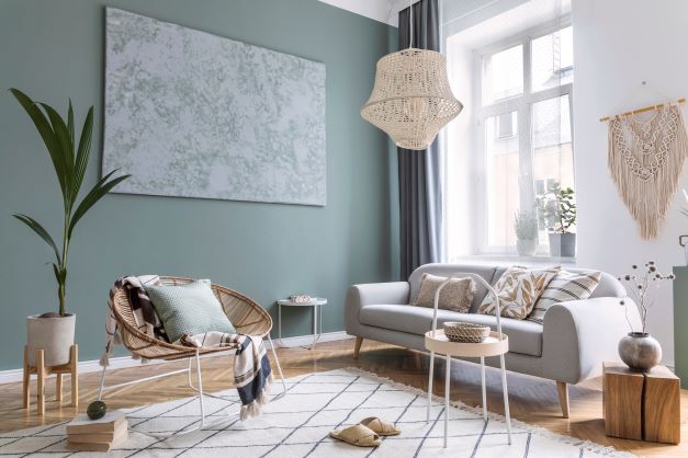
Creating accent walls provides one of the most common uses of accent colors in interior design. Some of the best accent wall ideas involve painting one wall in a room a different color from the rest to instantly draw attention and add depth to that room. Additionally, adding accent colors to them draws attention to architectural details like trim, paneling, and stair rails, which make key upgrades to home exteriors. This way, your accent wall ideas add to the room’s character without overwhelming the space.
Furniture and Accessories
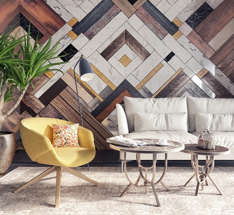
When decorating with accent colors, try adding them to a space via furniture and accessories. Upholstery, pillows, rugs, and artwork are excellent ways to add pops of color, especially in spaces like bedrooms, living rooms, and media rooms. You should also consider using metallic accents. Metallics make a space look more elegant and dramatic by balancing texture, brightness, and shine.
Small Decor Items
Smaller decor items like lamps, vases, and picture frames can also be used when decorating with accent colors. These items are easily changed and updated, allowing you to keep the space feeling fresh and dynamic via seasonal variations, for instance. Brighter shades like lilac, coral, or creamy yellows make great spring and summer shades, while more saturated tones are ideal for fall and cool tones for winter.
Case Studies and Examples
Several popular interior design color schemes demonstrate the versatility of accent colors in interior design:
- Earthy Tones: Sage green, beige, and cream white create a calming and natural feel.
- Coastal Themes: Blue, tan, and crisp white make a beachy, relaxed atmosphere.
- Classic Pairings: Blue and white, with calming neutrals as supportive colors, create a classic elegance.
- Traditional Looks: Burgundy, deep green, and brown provide a rich, classic vibe.
- Serene Palettes: Soft blues and greens paired with light neutrals make the environment peaceful and soothing.
Real-life examples of successful interior design color schemes include a modern living room with navy blue accents against a neutral background, or a vibrant kitchen where yellow highlights contrast with white cabinets, warming and energizing the room.
Tips and Best Practices
Effective use of accent colors in interior design starts with a well-put-together color palette outlining which shades will dominate and complementary colors to pair with the dominant shades. It’s essential to strike a balance: mixing clean colors with more subdued shades prevents the space from looking too busy or cluttered. It’s also important to use accent colors sparingly, as overusing them can lead to a visually overwhelming and chaotic environment.
Practical approaches for DIY enthusiasts and renters who may not be able to make permanent changes include using accent colors on furniture and small decor items. This lets them personalize things without committing to repainting walls or large furnishings.
The Impact of Accent Colors in Interior Design
Accent colors in interior design can transform rooms with very little effort. By understanding how to use accent colors, choosing them and applying them carefully (remember the 60-30-10 rule!), you can create a space that is both visually appealing and in alignment with your personal style as well as the atmosphere you want for the room. Try out different hues and enjoy the process of livening up your living space with the thoughtful use of accent colors.